Celestial Grimace is an Electronic-based, Hardcore band that was formed in 2012. As a founding member I assumed the responsibility of developing all aspects of its visual identity and content creation. The goal of this task was to create an identity that embraced the same themes that inspire the band's music, such as: Futurism, Technology, Science Fiction, Space Travel...
Developing An Ultramodern Visual Identity For My Band
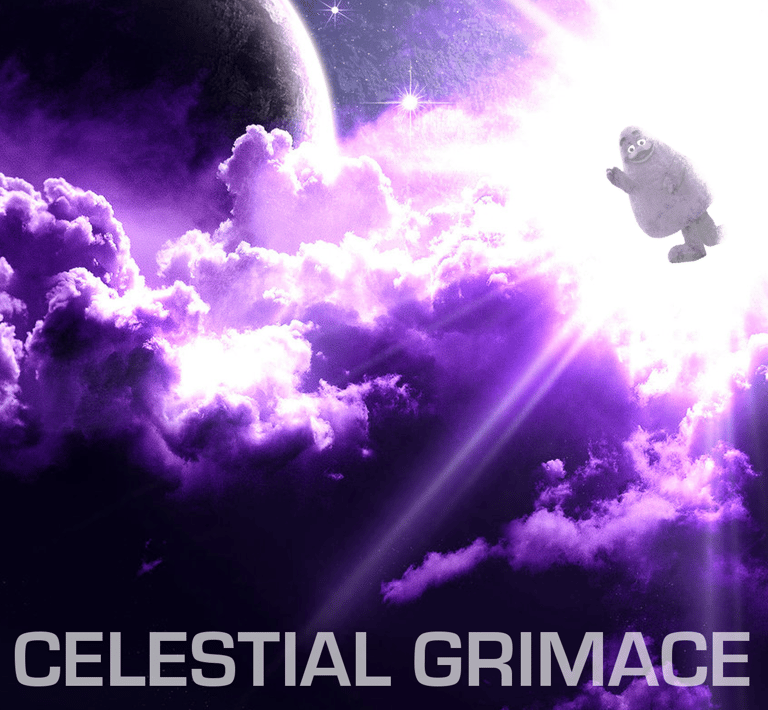
The band itself lacked direction in its early years having been founded as a fun side-project and treated with irreverence. The name Celestial Grimace was originally derived from a random name generator and selected due to its nonsensical nature. Jokingly, the visual presence of the band soon became personified by a certain purple restaurant mascot who resided in space.
Celestial Grimace would however mature over the course of those first few years and developed an ambition to pursue a professional career. To do so they would have to divorce themselves of all previous imagery and connotations and adopt a new, original visual identity.
History And Need For A Cohesive Visual Identity
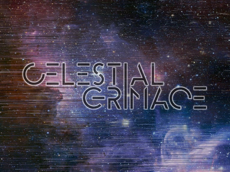
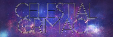
Several iterations were focused grouped among friends, family, and acquaintances but these three garnered the most attention. Some gravitated toward the typeface of the first design while others would lean toward the interconnecting "I" design of the latter two.
The final logo would be based on the Essence Sans Bold typeface. The font was chosen for its symmetrical and modern aesthetic. One notable exception is the "G" which was customized from the original "C". This was done for two reasons. The rotation of the C-shapes across the logo mimic the rotation of a loading reticle. Secondly the custom "G" resembles a "power button" symbol (or I/O symbol) turned on its side.
Lastly, I followed a common trend seen in other futuristic/science fiction typesets and selectively cut out certain parts of the letters. They needed to strike a balance between creating an intriging negative space and maintaining legibility.



Logo Design And Iteration
Typography
Essence Sans is the preferred typeface of titles and headlines for most media, especially when paired with the Celestial Grimace logo. Because the logo is originally derived from this typeface, its use ties the visual identity together.
Because Futura is not commonly accessible for web application, Jost was selected in its stead. Like Futura, Jost offers a typeface that is modern, angular, and symmetrical. Because of this we designate its use for headings.
DM Sans is our preferred web-friendly typeface for paragraphs and other small text applications due to its low-contrast geometric sans serif design.


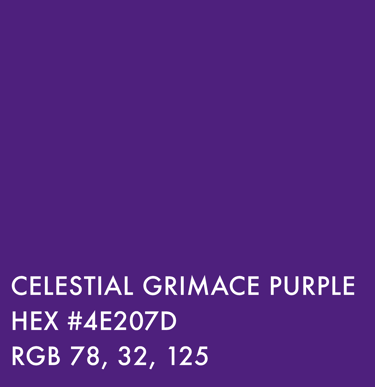
Perhaps the easiest element of the band's rebranding process was establishing its color palette. It seemed fitting to adopt the color purple as an endearing artifact from a less serious time.
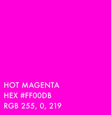
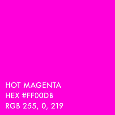
Hot Magenta was selected as a highlight color. Its vibrancy and energy contrasts not only visually but psychologically against the sophistication and serenity of the primary purple. A common use case for this color are the neon versions of the logo and CG icon.
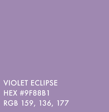
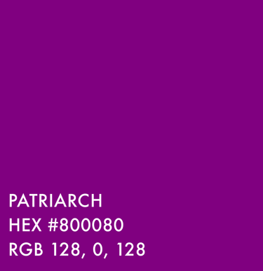
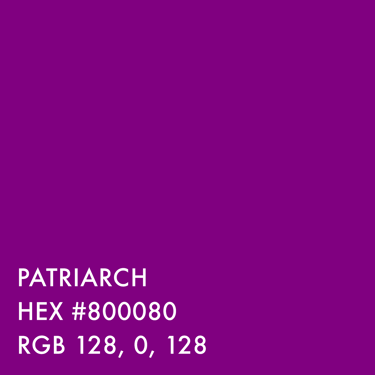
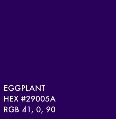
Violet Eclipse is used as a more subtle highlight color for the primary purple. Patriarch and Eggplant are commonly used as pallet swaps for Red and Blue respectively.
Color Palette
Application of Visual Identity in Album Artwork
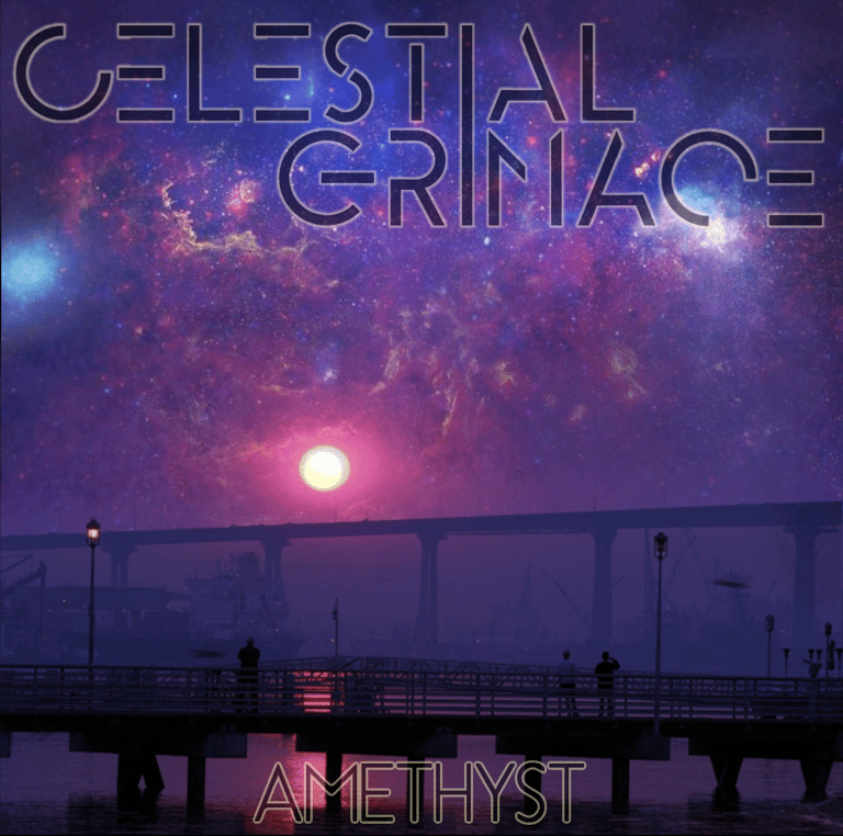

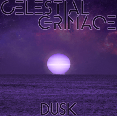
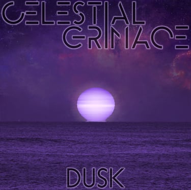
This album artwork, though never used as part of any official release, was the first original work designed after having established our visual identity and branding. The ethereal, extraterrestrial scene features a pronounced use of purple, includes our logo, and the title is written in the Essence Sans typeface in all caps.
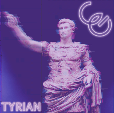
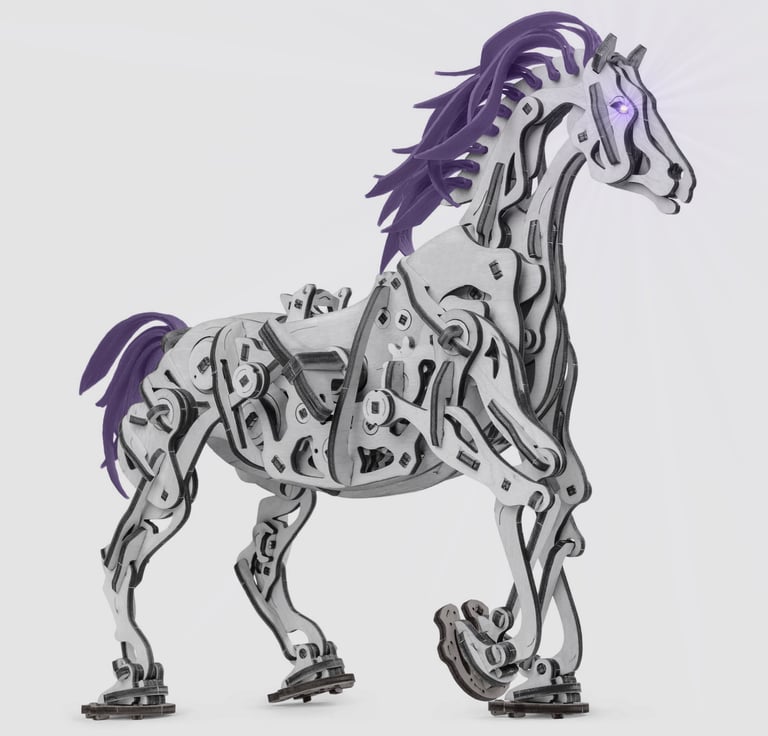
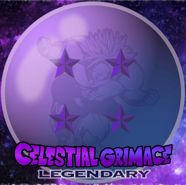
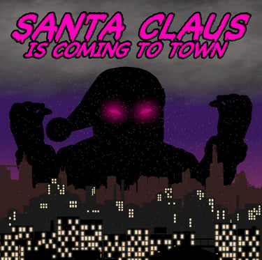
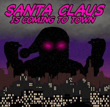
Sometimes an album artwork will lean toward the realm of homage or emulation, but not without including elements of our brand and visual identity. For instance, when we released our cover version of Lil Nas X's "Old Town Road" in 2019, I wanted to imitate the original song's cover art while staying true to our brand. The result was this image of this robotic stallion. I began by applying a subtle brushed-metal texture to the original image and give it glowing eyes. the final touch was to recolor the mane to a more brand-conscious color.
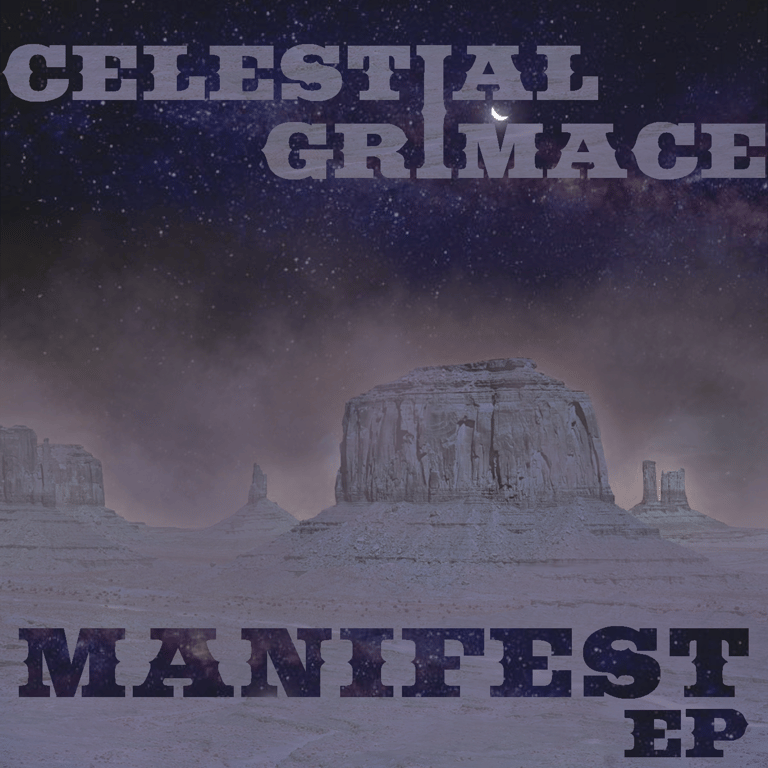
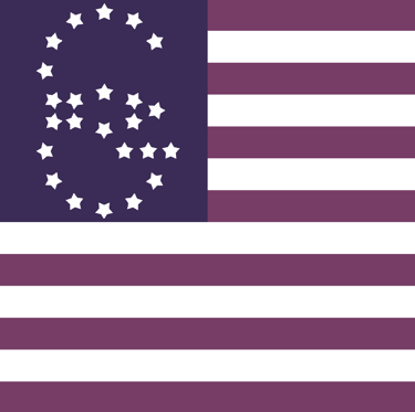
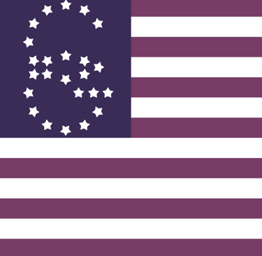
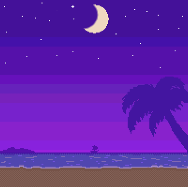
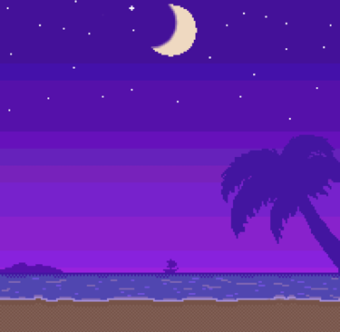
The cover art for our EP, Manifest is an example of incorporating our brand around a theme. In this concept album we mashed our particular style of music with Spaghetti Western influences. Likewise the cover artwork would also feature blended elements. The logo for this release is constructed using the "Saddlebag" typeface (by Dieter Steffmann) but still conforming to the interconnected "I" design like that of our standard logo. It also felt appropriate to use a combination of saturated and muted, earthy purples as a bridge between the two themes.
Covers and Homage
Themes and Concepts
Joint Ventures and Collaboration
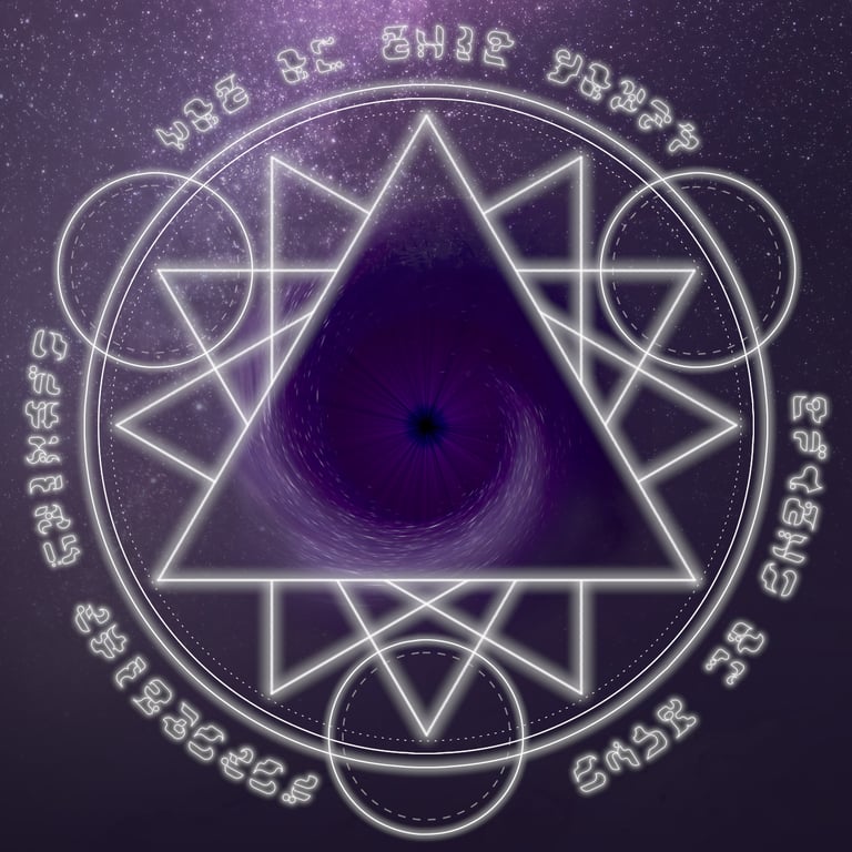
In 2020 we teamed up with our friends in Scythe of June to release a split-EP titled "Not Of This World". This was perhaps the hardest project to design for. Our desire for the title and cover art was to present something that reflected both bands' style and identity; certainly a challenge given that Scythe of June's brand is dark, macabre, and occult. After several rounds of brainstorming however we decided on an amicable theme of Dark Science-Fantasy. The artwork depicts the scene of an alien transmutation circle that has summoned a wormhole through space. For Celestial Grimace, this fit the concept of our three-song contribution which tells a story of an alien invasion and Earth's resistance.
For the alien-like script around the circle, I thought it would be cool to create my own typeface of nonsense glyphs with the added possibility of releasing it one day to fans as a fun easter-egg or language puzzle.


Merchandise & Branding
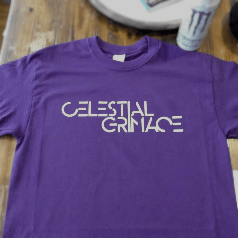
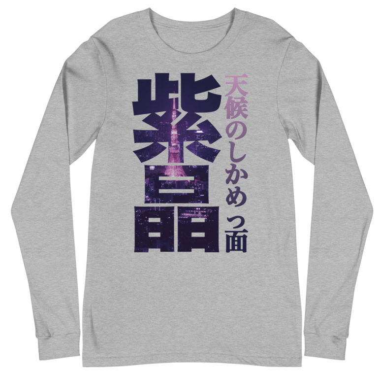
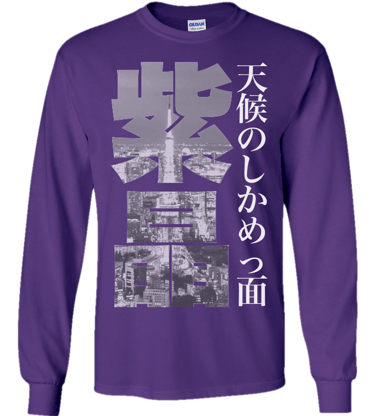
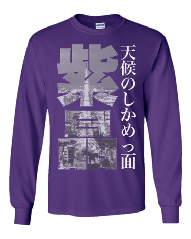
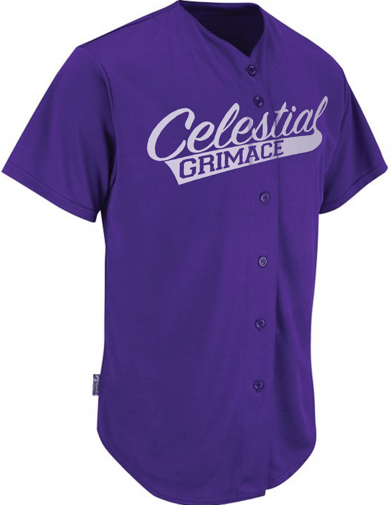
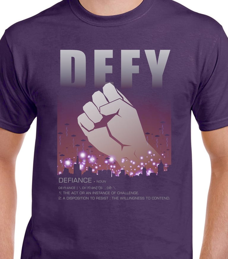
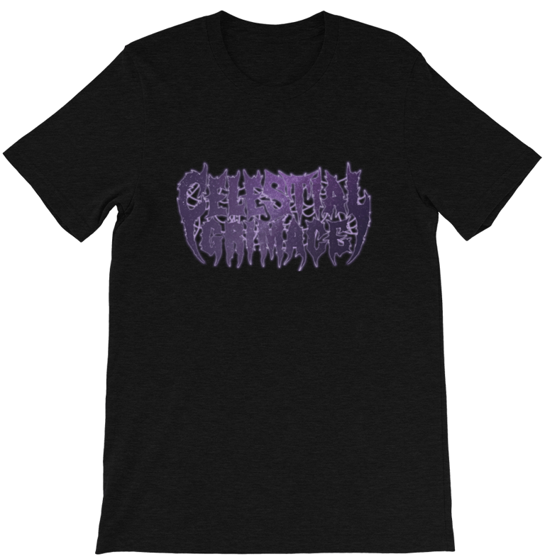
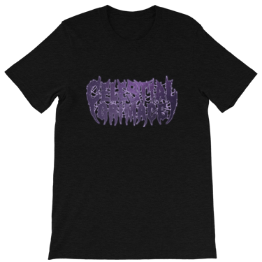
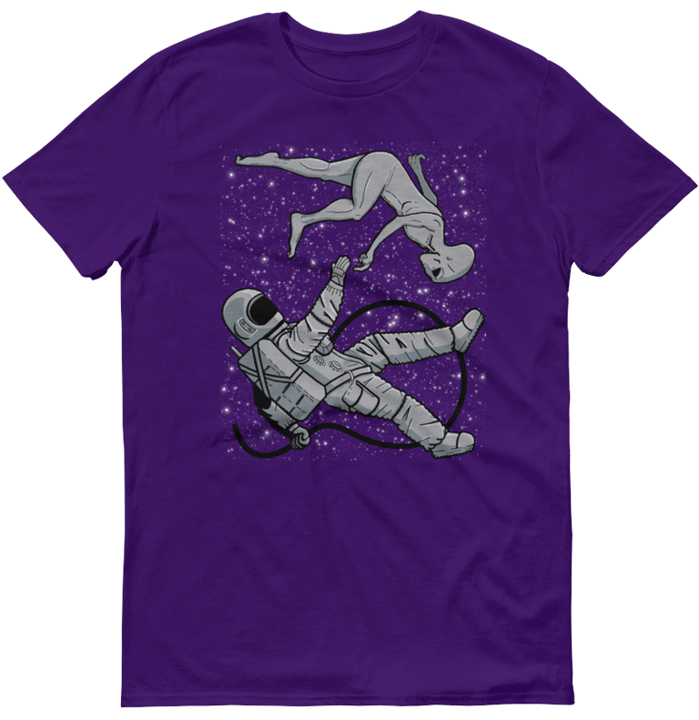
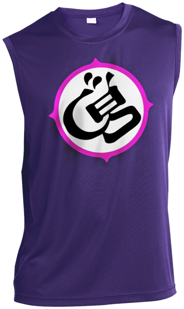
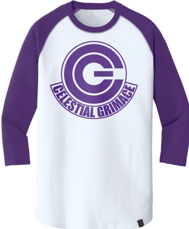
Every band needs merch and what is merchandise if not wearable billboards for your brand? When designing apparel it's paramount to make certain that our products are consistent with our visual identity.
Much like the approach to album artwork design, my goal whenever designing apparel and merchandise is to incorporate elements of our colors, our name, our logo, and our influences.




Content Creation and Social Media Presence
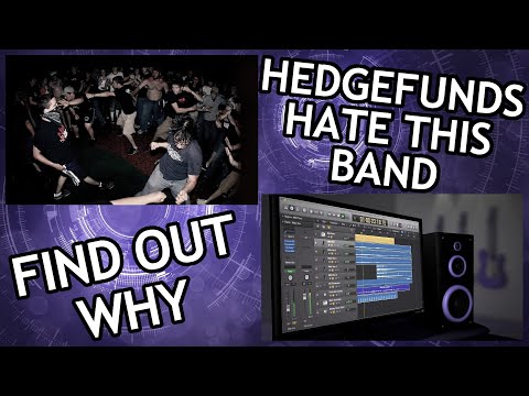
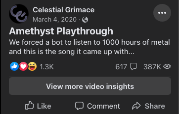
Our most successful awareness campaign came back in 2020 via Facebook Advertising. Having ran several headline tests, I was pleasantly surprised to see that the best performer fit well within our future-forward identity. At the end of our campaign we had just under 187k minutes of watch time, 690 organic shares/reposts, and our following nearly doubled in size.
Campaign Effectiveness
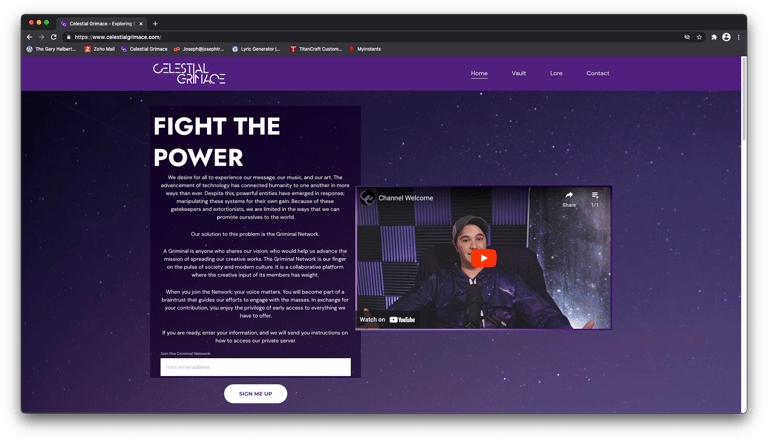
Growing our fanbase and expanding our brand awareness is achieved through social media advertising campaigns. These campaigns present their own set of challenges. Not only does one have to present content that is engaging, but, when making a first impression (especially to a cold audience) consistency is key. Having a firm visual identity helps alleviate this challenge of maintaining a cohesive brand across every platform that we and our audiences may occupy.
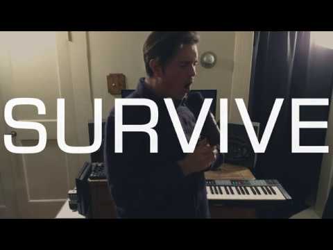
More Video Campaigns
