Cultivating Success: A Branding Design Journey
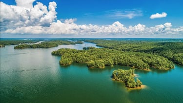
In 2019 I was approached by a long-time friend to design a logo for his upstart landscaping and tree removal business. Due to his rapidly expanding clientele, he needed something quick, simple, and effective. In short time I was able to provide for him a logo that he and I were proud of and is recognized all across the Lake Martin, AL area.

Client Background
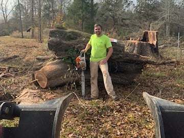
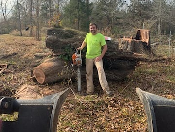
My friend Tyler has been in the lawncare industry since before he could even drive. When his previous employer retired from the business, my friend went into business for himself and easily assumed the customer base that his boss left behind. Since then he has expanded to broader landscaping services as well as tree removal.
When I was approached to create a logo for his business, he came to me with a name already established and newly registered – Madwind Landscape & Tree. As his business began to expand and new employees were needed to be hired, naturally he would need to brand his work equipment and work uniforms. This was especially important given that business has only been advertised via word-of-mouth. Having an instantly recognizable logo would be key to keeping his brand in the public mind. Though his initial request was for something "simple", he ultimately deferred to my skill and expertise. I certainly couldn't let him down after that.
Research & Inspiration
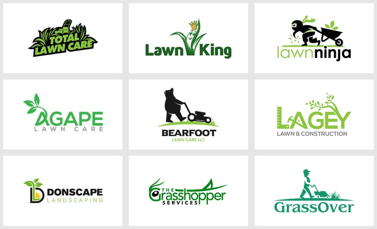
With a short deadline to work with, there was little time to dedicate to thoroughly analyze industry design trends or compare competing landscaping companies. Here are some of the trends I noticed at a glance:
1. Nature-Inspired Icons:
Leaves and Trees: Representing growth, vitality, and nature.
Flowers: Symbolizing beauty, creativity, and natural elegance.
Mountains/Hills: Suggesting stability, endurance, and landscaping terrains.
Water Elements: Such as ponds, streams, or waves, indicating freshness and natural harmony.
2. Minimalism:
Simplified Shapes: Minimalistic tree or leaf icons for a clean and timeless look.
Single-Line Art: Logos created with a single, continuous line for a modern feel.
Negative Space: Clever use of negative space to create dual imagery, like a tree within a house shape, indicating both landscaping and home services.
3. Typography:
Sans Serif Fonts: Clean and modern fonts for a professional appearance.
Handwritten Fonts: Adding a personal touch and emphasizing creativity and craftsmanship.
Combination Marks: Integrating icons with text for a balanced and versatile logo.
4. Color Palette
Green: Represents nature, growth, and freshness. It's a staple color in landscaping logos.
Earthy Tones: Such as browns and muted greens, conveying natural and organic vibes.
Complementary Colors: Combining greens with blues or yellows for contrast and visual appeal.
5. Geometric Shapes:
Hexagons and Circles: Symbolizing unity, harmony, and completeness.
Triangles: Representing stability, balance, and progress.
6. Tools and Equipment:
Shovels, Spades, or Gardening Tools: Indicating the hands-on nature of landscaping services.
Lawnmowers or Scissors: Representing precision and attention to detail in lawn maintenance.
7. Local Elements:
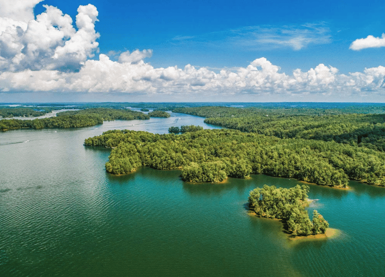
Local Flora: Incorporating plants native to the region, connecting the business to its locality.
Landmark Silhouettes: Integrating local landmarks subtly into the logo design.
Concepts & Iterations
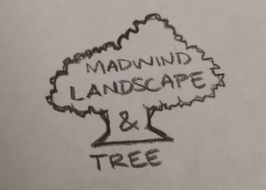
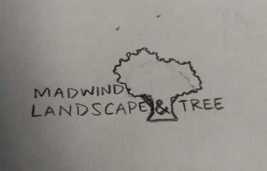
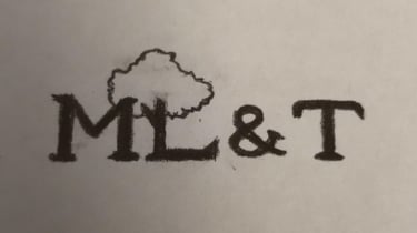
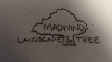
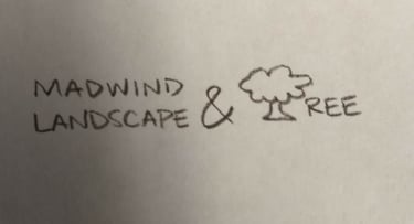
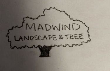


Some of the key concepts I wanted to hit on with this logo design were: Familiar Local Iconography, Organic color scheme, Establishing a feeling of respect and authority.
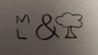
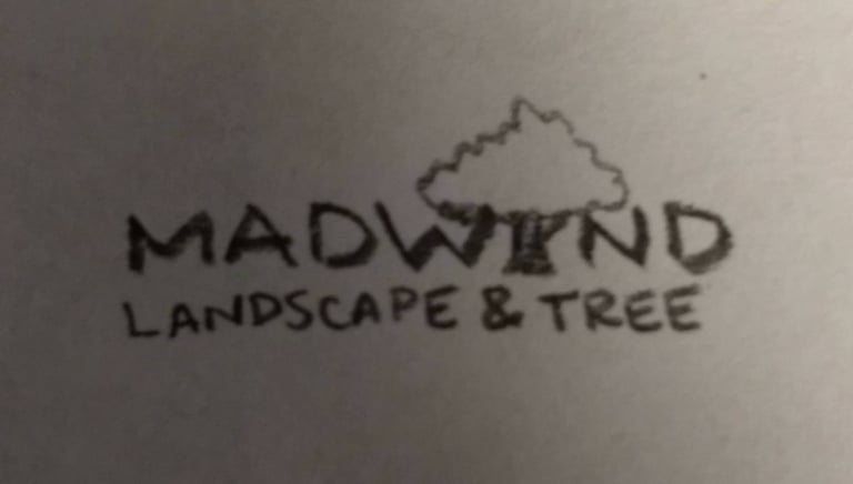
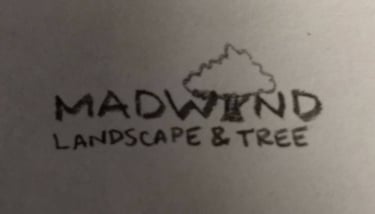
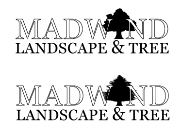
To begin the process I sketched out a few rough ideas, snapped a quick picture on my phone, and sent it to my friend for his opinion. At that time, the tree and stump removal service was his best seller. My initial idea was to lean heavily into the tree imagery and find ways to incorporate it into the text. After gathering feedback, he and I both came to the agreement that the logo incorporating the tree into the "I" of "Madwind" was the the strongest design and so we moved forward.
Design Process
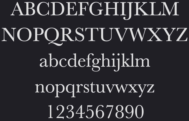
I would next take the design process to Photoshop. Because the trunk of our tree icon reminded of the feet of a serif typeface, I used that as the basis for this word mark. I needed a font that would evoke a sense of authority and trust, but could also serve as a design element for a tree-shaped icon.
The Baskerville typeface is one that I frequent often. It is renowned for its timeless elegance and sophisticated demeanor. Its bold and well-defined serifs, along with a balanced proportion between thick and thin strokes, have been said to exude a sense of authority and professionalism. When used in branding or communication materials, Baskerville conveys a strong sense of trustworthiness and credibility to customers. The typeface's historical significance and association with classical typography further enhance its trust-building qualities. Customers often perceive content displayed in Baskerville as reliable, authoritative, and dependable, fostering a sense of trust that is crucial in building strong and lasting relationships between businesses and their clientele.
The next element I needed to address was a request from my friend himself. He felt that a pine tree would be better suited for the logo. This is an excellent choice given the ubiquity of pine trees along the Lake Martin coastline and surrounding area.

Branding Colors
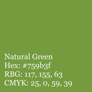
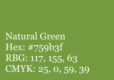
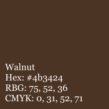
The colors #759b3f and #4b3424 were chosen for this landscaping logo due to their natural appeal and harmonious contrast. #759b3f, a vibrant green, signifies growth and nature, reflecting the business's vitality. #4b3424, a rich brown, represents the earth, grounding the logo and symbolizing reliability. Together, they evoke a sense of trust, organic beauty, and a deep connection to the outdoors, making them perfect choices for the brand's identity.


Final Design
Logo Applications
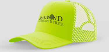
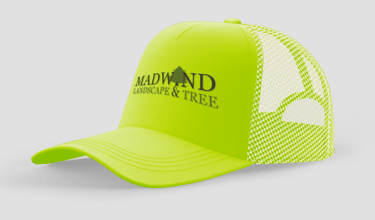
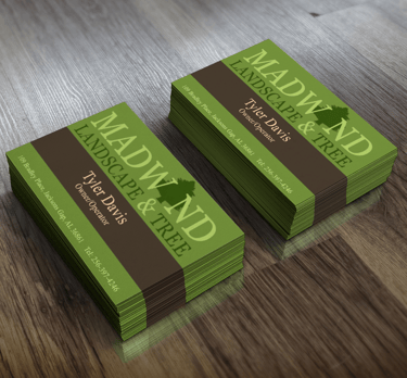
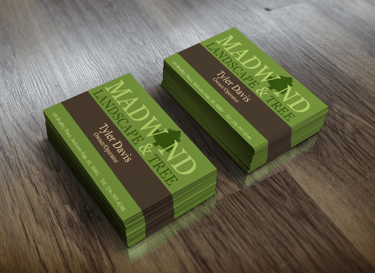
In my own time, I went back and created a few sample mock-ups. Though we had not established a brand or visual identity proper, I used the same principals as I would in other branding efforts.
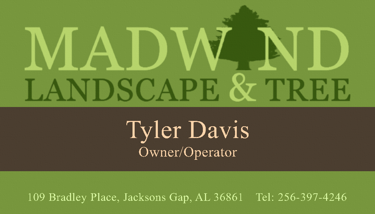
For the business card I stuck to the two brand colors and used the black and white version of the logo, modified with an overlay effect.
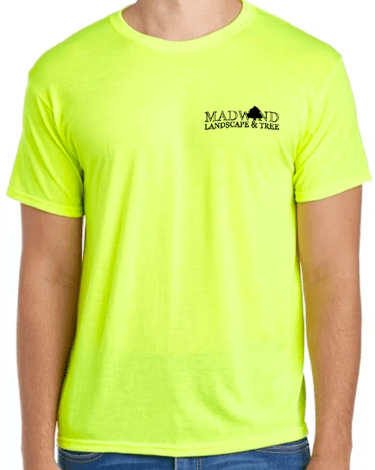
For the work shirt I applied a black, one-tone logo to contrast with the safety yellow.
Lastly, the hat could have also been made as a one-tone, but given that this might be used for both work and promotional material, I decided to mock it up with the original green and brown logo.
Mock-ups
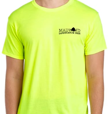

Real-life Collateral
My client would go on to enlist a local printing company to produce the collateral for his business. It was apparent that their designers took some creative liberties when reproducing the logo.
Though there are no formal guidelines set for the appropriate use of the logo and branded collateral, I do think that there are some examples of bad branding that should be addressed.
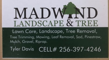
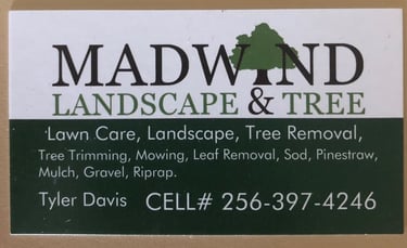
The business card and lawn signage are my first example. There are several elements that could be improved, most notably, is that the incorrect logo has been used.
The next issue I would address is the lack of adherence to the Brand Color Palette.
On the business card, the brown of the wordmark has been changed to black. And on both pieces, the green divider is a completely different shade.
Two key typography mistakes are displayed with these similar designs. The card seems to show a lack of cohesive hierarchy. The mismatch of type alignment and unbalanced type sizing makes the overall design feel disjointed and chaotic. The signage is less offensive but does suffer from a lack attention to detail as "removal" is orphaned from the rest of the phrase.
I would be remised if I did not include an area that I believe worked well.
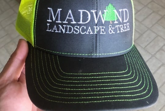
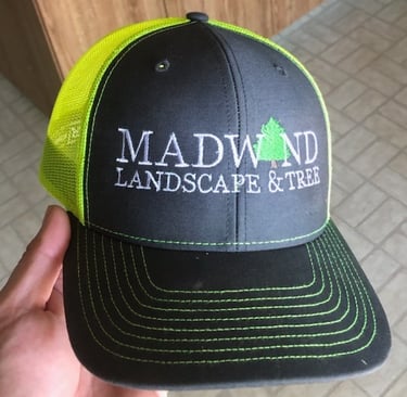
The work hat seen here features what is effectively a black canvas. The contrast created by making the wordmark all white while leaving the pine-tree icon in its brand colors is an acceptable alternative to the original logo. I have to credit the designer for maintaining the brand integrity in a way that I had not foreseen.


Conclusion
In developing this business logo, every element was purposefully chosen to encapsulate the essence of nature, growth, and reliability. From the timeless typeface selection meant to evoke authority to the thoughtfully selected colors harmonizing vitality and grounding, the logo embodies the business' commitment to natural beauty and trustworthiness. It stands not just as a visual representation but as a testament to the business's dedication to quality and excellence, inviting customers to experience pride in their landscapes with confidence and assurance.
