Designing A Logo For An Eclectic Band
From 2015 to 2017 I was a part of a rock band whose members all came from a diverse set of backgrounds and ideologies. That diversity forced us to find commonalities in musical interests and visual identity. In many ways, just settling on a name helped bring this motley crew (pun intended) together to then go out and perform as a cohesive unit. But we would first need a logo to accompany our journey.

Deciding A Name
Our band's origin began with two high school friends having reached out to myself and another stranger over Craigslist. We would meet up and jam a few times to gauge compatibility and fit. We were all very interested in pursuing music professionally and as musicians we collaborated very well. Because our interests as individuals were so different, however, there was quite a bit of creative disagreement.
As we began to feel more comfortable about seeking gigs and shows we knew we would need a name. Every week of practice, each member would bring a few new names to the pool. After several rounds of ranked voting, the winning name was: "Those Who Can't".
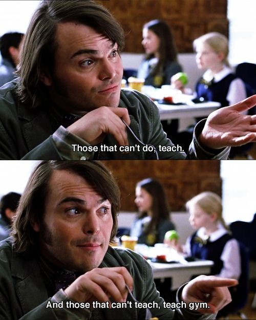
The phrase "Those who can, do; those who can't, teach" originated from the play "Man and Superman" by George Bernard Shaw. I, however, would remember it as line from the movie "School of Rock".
Because of my background as a recent Studio Art graduate, I took on the task of creating our logo and other visual elements.
Design Iterations
We mulled over several designs; some less inspiring than others.
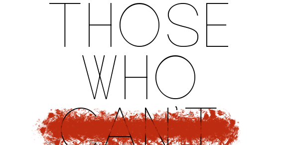
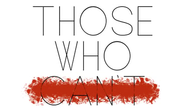
One such design was a thin sans-serif logo with a sort of bloody strike through the "Can't". The elegance and modernism of the typeface didn't quite fit our collective personality and the strike-through overpowered the overall design.
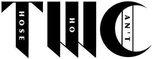
Another unsuccessful design is one I refer to as the "block" design. This design attempted to use asymmetry and shared letters to create one condensed form factor. The result was crowded and overly complex.


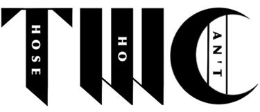
The last iteration of our logo drew inspiration from calligraphy. The simple geometry and sharp corners represented a step toward the right direction. From this we began to gravitate toward elements reminiscent of school. The vertical lettering still made the logo too much of a chore to decipher though, but we did feel that the bold letters were a strong foundation.
Final Design
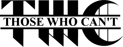
Our final logo design would feature the modern geometric calligraphy initials with a much more legible wordmark running across them. Times New Roman was used to construct the wordmark as homage to high school and college in which Times New Roman was the approved typeface of the MLA format.
As a band of unlikely friends one could liken it to the "Breakfast Club" and other similar 80's high school film troupes. Just like teenagers must navigate social awkwardness through high school, we as a band embraced the navigation of our own social awkwardness that held this band together.


Logo Application
Unfortunately the lifespan of this band was short lived due to several factors. As a result, there was not a lot of collateral or mock-ups made during this venture, but there are a couple of pieces that can be highlighted.
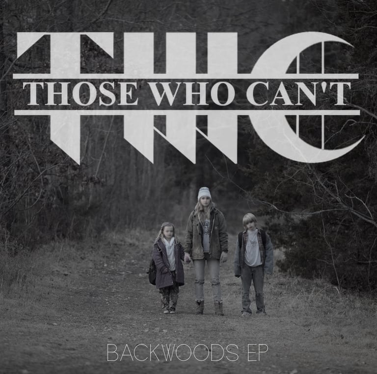
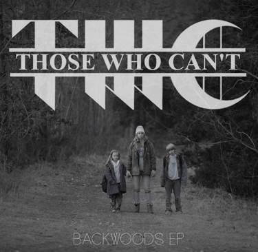
Though there was not an official release we did have plans to release an EP. I created a proposed cover art based on one of the titles we kicked around "Backwoods" - a reference to the fact that our practice space and recordings exist in a fairly rural part of the state.
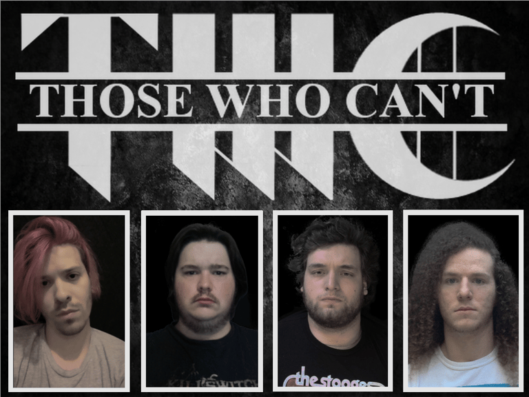
Our first ever performance together was a Battle-of-the-Bands competition for the 2016 "Rock The Park" event in Montgomery, AL. As part of the entry requirements, we needed to submit a band photo. Given our limited time and financial resources I had each member send me a headshot that I then put together in the form of a postcard. The biggest challenge was trying to make four differently sourced photos feel cohesive. Knowing what I do now, I would have started with white balancing the photos so that the color grade would be closer to each other. With the skills I have now, I would not have used a solid black background but would have tried to make the background softer, perhaps a gradient like that of a professional photography studio, and added a soft drop shadow for depth.
Conclusion

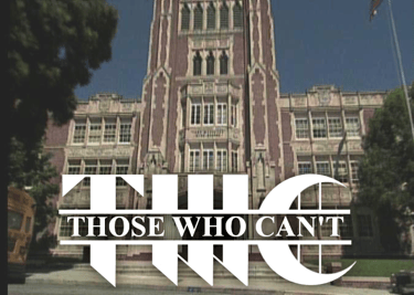
Our final logo was bold, balanced, sharp, and concise. Though our time as band together was short lived, I feel that we had the beginnings of a strong brand and visual identity.
Our logo was instrumental in establishing our band as a legitimate and professional group. In turn that would help convince event organizers to take a chance and give us an opportunity to perform.
